

You know the long shadow design trend, right? Although, I’m not even sure this is a trend anymore, everything moves so fast… Anyway, long shadows used to be and / or still are a trendy design trick to give some emphasis to some text or an element.
There is no easy way to create a long shadow in CSS. At the end of the day, either you use some image-based format (an actual image, SVG…) or you rely on text-shadow and box-shadow. The latter options are better because they are nothing but CSS that can be handled very nicely by the browser.
The Problem is: that it is a pain to write. To achieve a clean long shadow effect, you have to build a chain upwards of 50 shadows or so, slightly shifting values one step at a time, possibly the color as well… Completely impractical. This is typically the kind of thing you want to automate with Sass or whatever tool floats your boat.
Indeed, there have been many attempts at making a long shadow mixin. Among the solutions I have seen, I have noticed problems, including:
- no way to define the direction;
- no way to define the number of shadows;
- only works for
text-shadow; - overly complicated.
Well fasten your seat belt folks because I have found what I dare to call a clean solution. I have built a ~15 lines long property-agnostic long-shadow function that accepts a direction (as well as a few other arguments).
The API
Because we want our tool to work with both box-shadow and text-shadow properties, we will not actually build a mixin like the title of the article says, but actually a function. Then, you’ll be able to use it like this:
|
1
2
3
4
5
6
7
|
.foo { box-shadow: long-shadow($args...);}.bar { text-shadow: long-shadow($args...);} |
Indeed, box shadows and text shadows are almost identical except that box shadows have a blur parameter that we will not use. Note that Internet Explorer 10+ supports blur for text shadows as well… True story.
Our function needs a couple of things to work:
- a direction, in a similar fashion to
linear-gradientso either a keyword or an angle (indeg,rad,gradorturn); - a length;
- a color;
- whether or note the shadow should fade (the default is
false); this is either a boolean (wheretruemeans fading to transparent) or a color to fade to; - the number of shadows to compute (the default is
100).
|
1
2
3
4
5
6
7
8
9
10
11
12
13
14
15
16
17
18
19
20
21
22
23
24
25
26
27
28
29
30
31
32
33
34
35
36
37
38
|
/// Function to generate long shadows (because flat is so has-been)./// Property-agnostic: works for both `box-shadow` and `text-shadow`./// `cos` and `sin` might need to be polyfilled if Compass or any/// equivalent such as SassyMath is not in use.////// @author Hugo Giraudel////// @link https://unindented.org/articles/trigonometry-in-sass/ Pure Sass `cos` and `sin`////// @param {Direction} $direction/// Shadow's direction (angle or keyword)/// @param {Length} $length/// Shadow's length/// @param {Color} $color/// Shadow's color/// @param {Bool | Color} $fade [false]/// Whether or not shadow should fade:/// - `false` means no fading, shadow is `$color`/// - `true` means fading from `$color` to transparent/// - a color means fading from `$color` to `$fade`/// @param {Number} $shadow-count [100]/// Number of computed shadows////// @return {List} - List of shadows////// @require {function} Compass/helpers/math/cos/// @require {function} Compass/helpers/math/sin////// @example scss - Usage/// .foo {/// text-shadow: long-shadow(42deg, 1em, #16a085);/// }/// .bar {/// box-shadow: long-shadow(to top left, 150px, hotpink, tomato);/// }@function long-shadow($direction, $length, $color, $fade: false, $shadow-count: 100) {} |
Building the function
Now let’s get started with the function. The first thing we have to do is convert $direction to an angle if it is a keyword (e.g. to right being 90deg). Doing so is extremely straightforward; we only need a conversion map.
|
1
2
3
4
5
6
7
8
9
10
11
12
13
14
15
16
17
18
|
$conversion-map: ( to top: 180deg, to top right: 135deg, to right top: 135deg, to right: 90deg, to bottom right: 45deg, to right bottom: 45deg, to bottom: 0deg, to bottom left: 315deg, to left bottom: 315deg, to left: 270deg, to left top: 225deg, to top left: 225deg);@if map-has-key($conversion-map, $direction) { $direction: map-get($conversion-map, $direction);} |
At this point, there is only one thing left to do (yes, already!): iterating from 1 through $shadow-count, each time computing a new shadow.
|
1
2
3
4
5
6
7
8
9
10
11
12
|
// ...$shadows: ();@for $i from 1 through $shadow-count { // ... $shadow: ...; $shadows: append($shadows, $shadow, 'comma');}@return $shadows; |
Now we will need to compute $shadow. At first I thought it would be a pain, but it turns out to be basic trigonometry. We only need to compute the sin of the angle for the x offset and the cos of the angle for the y offset. Then, we multiply both by the length of the long shadow divided by the number of total shadows, multiplied by the current index of $i.
|
1
2
|
$x: sin(0deg + $direction) * ($i * $length / $shadow-count);$y: cos(0deg + $direction) * ($i * $length / $shadow-count); |
You may wonder why we append the $direction (an angle) to 0deg. Actually, this is a clever way to cast the second value into the first’s unit. In this case, if $direction is expressed in gradients, radians or turns, it is automatically converted in its equivalent in degrees.
Regarding the color, it is a bit trickier. Depending on the value of $fade, we have three options:
- if
$fadeisfalse, then the color is$color; - if
$fadeistrue, then we fade from$colorto transparent; - if
$fadeis a color, then we fade from$colorto$fade.
So unless $fade is false, the color slightly varies at each loop run, so we will need to compute it every time.
|
1
2
3
4
5
6
7
8
9
10
|
// If `$fade` is `false`$current-color: $color;// If `$fade` is a color@if type-of($fade) == 'color' { $current-color: mix($fade, $color, ($i / $shadow-count * 100);// If `$fade` is `true`} @else if $fade { $current-color: rgba($color, 1 - $i / $shadow-count);} |
… or as a one liner:
|
1
|
$current-color: if(not $fade, $color, if(type-of($fade) == 'color', mix($fade, $color, ($i / $shadow-count * 100)), rgba($color, 1 - $i / $shadow-count))); |
So at this point our shadow (to be appended to the shadows list) is:
|
1
|
$shadow: $x $y 0 $current-color; |
The whole function
|
1
2
3
4
5
6
7
8
9
10
11
12
13
14
15
16
17
18
19
20
21
22
23
24
25
26
27
28
29
30
|
@function long-shadow($direction, $length, $color, $fade: false, $shadow-count: 100) { $shadows: (); $conversion-map: ( to top: 180deg, to top right: 135deg, to right top: 135deg, to right: 90deg, to bottom right: 45deg, to right bottom: 45deg, to bottom: 0deg, to bottom left: 315deg, to left bottom: 315deg, to left: 270deg, to left top: 225deg, to top left: 225deg ); @if map-has-key($conversion-map, $direction) { $direction: map-get($conversion-map, $direction); } @for $i from 1 through $shadow-count { $current-step: ($i * $length / $shadow-count); $current-color: if(not $fade, $color, if(type-of($fade) == 'color', mix($fade, $color, ($i / $shadow-count * 100)), rgba($color, 1 - $i / $shadow-count))); $shadows: append($shadows, (sin(0deg + $direction) * $current-step) (cos(0deg + $direction) * $current-step) 0 $current-color, 'comma'); } @return $shadows;} |
Examples
|
1
2
3
4
5
6
7
8
9
10
11
12
|
.foo { text-shadow: long-shadow( // Shadow should have an angle of 42 degrees $direction: 42deg, // Shadow should be contain within a 100x100 box $length: 100px, // Shadow should start this color $color: #16a085, // To finish this color $fade: #1abc9c );} |

|
1
2
3
4
5
6
7
8
9
10
11
12
|
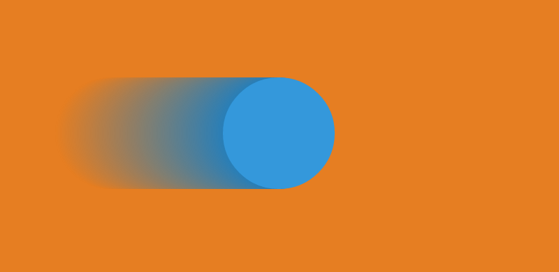
.bar { box-shadow: long-shadow( // Shadow should go to bottom right (45deg) $direction: to left, // With a length of 15em $length: 15em, // From this color $color: #2980b9, // To this color $fade: #e67e22 );} |
|
1
2
3
4
5
6
7
8
9
10
11
12
13
14
|
.baz { box-shadow: long-shadow( // Shadow should have an angle of 25deg $direction: -125deg, // Spread on 120px $length: 120px, // From this color $color: #8e44ad, // To transparent $fade: true, // With only 10 shadows $shadow-count: 10 )} |

Final thoughts
That’s it my friends! I hope you like both the power and the simplicity of this approach. Feel free to suggest any improvement and be sure to have a look at the code on CodePen!
- Log in to post comments